The Importance of Color in Promotional Materials
Color is powerful. It can convey emotions, both good and bad, and it can even signify royalty.
You probably took some time to consider the colors that make up your brand and company logo. You should also take time to consider what the colors you’re using in your promotional materials say about your business, products, or services.
Does color really matter?
The short answer: Yes.
Color can help your customers or prospective customers learn a lot about your business. Along with typography, your logo, and the characteristics of the visuals you use, color is a primary recognition factor for your brand.
While the effect color can have on people can be subtle, colors can have an emotional impact. That emotional effect, when tied to your brand and their experience with your company, can make someone a customer for life.
How does it make them feel?
If each color sends an emotional message, it’s crucial to have at least a basic understanding of what those messages might be.
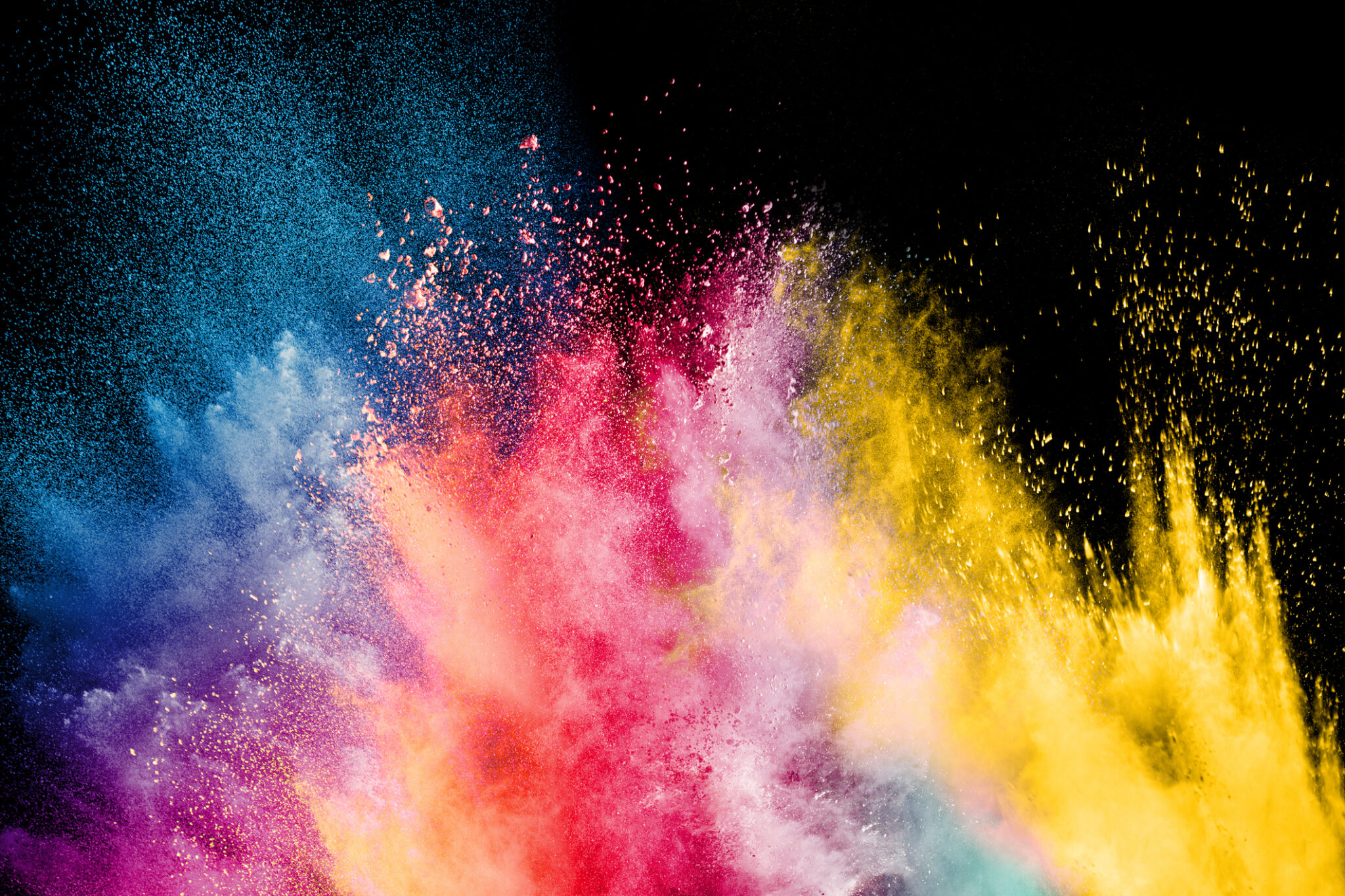
Warm colors like shades of red and orange and are exciting and stimulating. Blue is reliable and steadfast and green indicates health or eco-friendliness; it is also the color of money in the United States. Yellow is cheerful and often reminds people of sunshine. Violet and purple have long been the color of royalty and can also be seen as artistic or meditative.
Shades like black and white can be more complicated based on culture. Black can indicate grief and mourning in the United States and Europe; it can also indicate luxury and sophistication. White is perceived as pure and peaceful but can also come across as sterile. Gray can be seen as boring, but it can also be analytical or technical.
When combined, certain colors can also signify seasons, holidays and other cultural events. Pastels like lilac purple, pale pink and light green can make people think of spring. Red and green together immediately evoke Christmastime. And combining red, white and blue is patriotic and reflects the American flag.
How to Use Color to Draw People In
As you’re thinking about your promotional materials, think about the reaction you’re trying to elicit from your audience. Do you want them to be excited about an upcoming sale? Use reds and oranges. Are you selling a natural, healthy or earth-conscious product or service? Use shades of green that evoke nature.
As you’re putting together your promotional materials, think of the effect you want to have on your audience and select your primary color. Then select complementary or contrasting colors to temper or fine-tune that impact.
For example, hospitals and other medical companies frequently use blue in their branding, indicating reliability and trust. White is also a common brand color in these industries, evoking purity and sterility. Occasionally, they’ll use cheerful yellow or exciting orange as a contrasting accent color. You’ll notice that they rarely use black, as black can represent death.
What Do Your Colors Say About Your Business?
The colors you use can send a powerful if subtle message. Choose them wisely and work with a printing partner you can trust to make sure the colors you’ve selected are the ones you get. Having your materials printed with a swampy olive can send a very different message than a bright, leafy green.