- Phone 1309.489.0026
- Phone 2563.278.3389
- Youtube
News
By: Team WTI | Date: September 17, 2019
Categories: Local SEO, Website Design Articles,
Tags: Eye Tracking, F-pattern, Reading, SEO, Team WTI, Website, Website Design Articles, WTI,
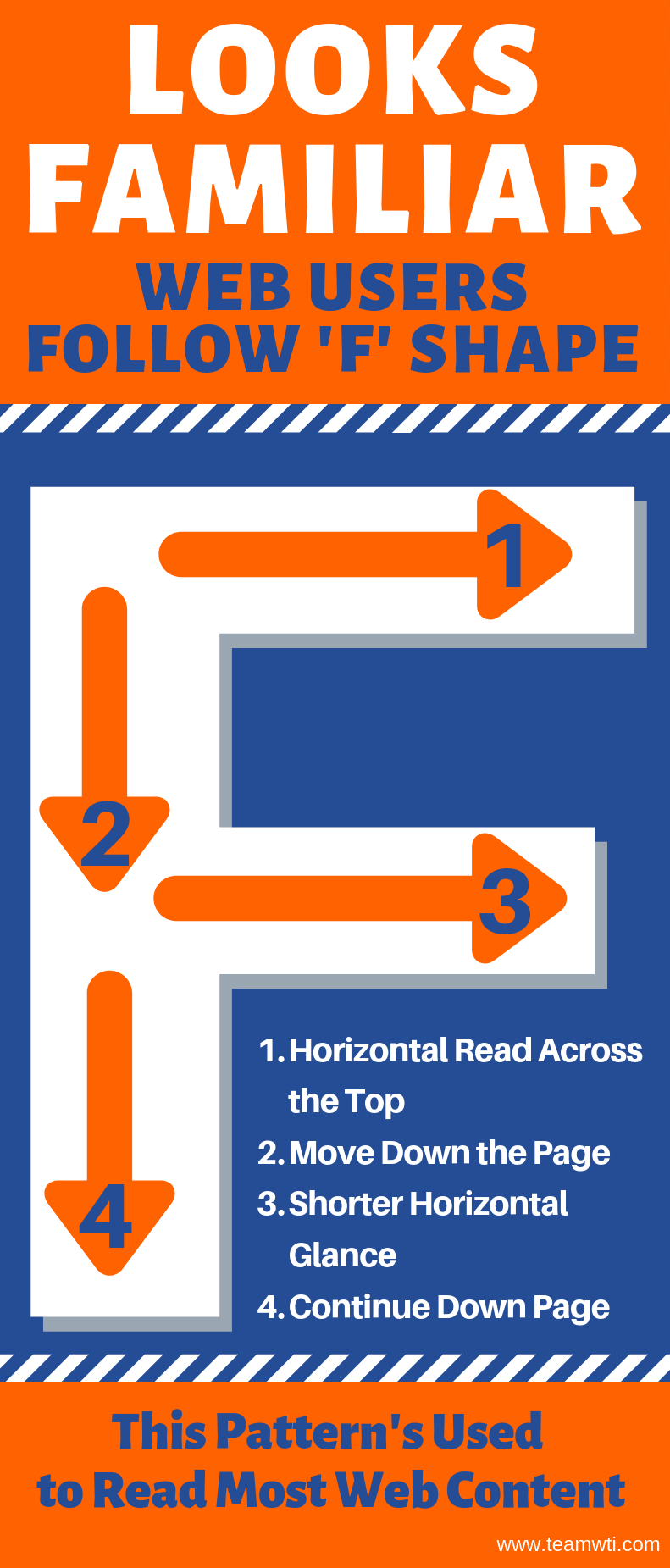
Are viewers giving your website an F? Most likely, but that’s OK. The “F” refers to the reading patterns followed when looking at a site.
First, users look in a horizontal movement across the upper part of the page (like the top “bar” of the letter “F.”)
A reader will next move down the page a bit, looking at content on the left-hand side.
That’s followed by another horizontal glance across the middle of the page. The second horizontal glance is often shorter than the first, and represents the lower “bar” of the letter “F.”
Finally, a reader continues scanning the left-hand side of a page in a vertical movement.
Known as the “F-Pattern,” it is the most common eye-scanning pattern.
A page with a lot of content is prone to users resorting to the F-pattern. Readers especially use the pattern on text-heavy pages.
When users glance at a page using the F-reading patterns, it means the first lines of text are seen more than subsequent lines of text.
It also means the first few words on the left side of your page also receive more views.
Web users tend to look at pages quickly. They want to find the information they need and then move on. As a result, the F-pattern comes into play.
However, when users scan your page in an “F” shape, they may miss important information – especially if that information happens to be on the right side of the page.

Contact the experts at Team WTI to ensure your website impresses.

Andy Snyder | Mississippi Valley Fair
VIEW WEBSITE

