Monsanto is the name of a ceased agricultural company that operates in the United States from 1901 until 2018. The company specialized in biotechnology and bioengineering in the agricultural segment and was bought by German giant Bayer in 2018.
Meaning and history
Today, Monsanto is at the forefront of the latest high-tech solutions to help farmers produce better crops by using water, soil, and other resources more efficiently and sparingly. Together with farmers, research institutes, community organizations, and universities, Monsanto is actively and openly engaged in finding effective and responsible solutions to the difficult challenges of our time, such as a growing world population while reducing its resources.
Monsanto was founded more than a century ago, in 1901, and today is a Fortune 500 company, and in June 2015 the company was named one of the top 100 employers in Europe by the Great Place to the Workresearch center.
Monsanto’score business includes the production of agricultural grain and vegetable seeds and crop protection chemicals. Monsanto employs more than 20 thousand people worldwide.
What is Monsanto?
Monsanto is the name of a former agricultural corporation, which specialized in biotechnology until 2018, and then was acquired by Bauer, a famous German pharmaceutical group.
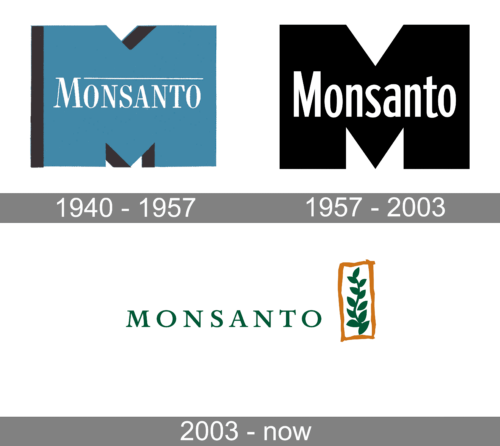
1940 – 1957
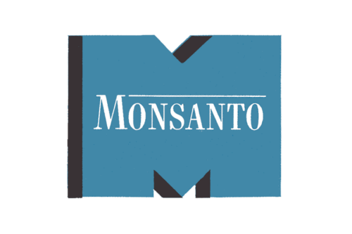
The 1940 emblem set the precedent for the following design, which was used for the majority of the brand’s history. This one features a strikingly wide letter ‘M’ colored an unsaturated turquoise shade. They’ve also given it some depth, where the ‘walls’ of the character are colored black.
Moreover, they’ve placed the company name in the center of this logotype, colored white. Although all of these letters are capitalized, the first character is slightly bigger. Furthermore, a thin line extends from the top of the letter ‘M’ to the right the entire width of the text. The font is a simply office-style serif.
1957 – 2003
The initial Monsanto logo had nothing in common with the light and friendly badge from 2003. It was a solid and powerful monochrome emblem with the white narrowed sans-serif “Monsanto” inscription in the title case placed over the enlarged massive letter “M” in plain black. The “M” featured its upper bars cut and flat, while the middle bar was sharp and pointed down like an arrow.
2003 – 2018
The American corporation has a very memorable and lively logo, evoking a sense of unity with nature and kindness. The logo was composed of a traditional and modes wordmark and a playful bright emblem on its right.
The logotype in all capitals was executed in a classy serif typeface with distinct lines and pretty big serifs. The font looks similar to Erasmus RR Medium Expert and Carrie Pro Medium, which are traditional typefaces, with an old school mood.
The calm forest-green color of the wordmark is also used for one of the emblem’s elements — a green branch, which is placed vertically and enclosed in a bold orange frame. The frame looks uneven and amateurish as if I Alt was drawn by a kid, and this is what makes the whole logo unique and evokes a very warm and friendly feeling.
The green and orange colors of the Monsanto logo is a representation of unity with nature and Earth, as well as growth and togetherness. Placed on a white background it also reflects loyalty and trustworthiness, and the orange framing symbolizes passion and energy along with happiness and smiles.
The Monsanto logo is unique and instantly recognizable. The childish contours and classic font are in total harmony here, which is a very rare thing. Truly, a masterpiece of contemporary visual identity design: simple, laconic, elegant.
Font and Color
The elegant uppercase lettering from the primary Monsanto badge was set in a bold and classy serif font with stable characters and delicate serifs on the end of the bars. The closest fonts to the one, used in this insignia, are, probably, Caslon SB Regular SC, or Miranda Pro Bold, but with some minor modifications of the contours.
As for the color palette of the Monsanto visual identity, it is based on two dark shades of green and orange, the colors of nature, growth, and energy, with all elements placed against a white background for lightness andbetter readability.


